
What if improving your website’s ecommerce user experience could instantly boost conversions? In ecommerce, UX shapes how customers perceive your brand, find products, and complete purchases. A well-designed experience builds trust, increases order value, and keeps users coming back.
At DigitalSuits, we outlined 12 ecommerce ux best practices to help you enhance usability, improve customer satisfaction, and drive more sales.
What is good ecommerce UX and why it matters
Good ecommerce UX delivers a fast, seamless, and enjoyable shopping experience that allows users to find products, navigate easily, and complete purchases with minimal effort. It encompasses all phases of the customer experience – from browsing to post-purchase – and focuses on usability, consistency, and satisfaction.
UX design goes beyond visuals. It is about making your site user-friendly. To do this, the designers need to know:
- What users want to achieve on each page.
- The reason they interact with it.
- How design and features can help them reach their goals.
Here’s what good UX for ecommerce does for you:
Increases conversions. An intuitive experience for visitors increases the likelihood that they will complete their purchase.
Boosts loyalty. When users engage with your site, they are more likely to come back, and one-time buyers are converted into loyal customers.
Removes purchase barriers. When a designer is mindful of the ecommerce UX design, the friction points that may prevent purchases are eliminated.
Strengthens brand perception. A reliable, convenient site implies credibility and establishes your brand’s reliability.
Reduces bounce rates. An intuitive interface and easy navigation keep visitors engaged and encourage them to spend more time exploring.
Improves customer satisfaction. A smooth experience makes a visitor feel understood, valued, and closer to your brand.
Enhances accessibility. By providing inclusive UX, you can make your site accessible to everyone, regardless of ability, thereby capturing a wider audience.
Supports SEO performance. User-friendly sites also rank higher with search engines thanks to faster load times and lower bounce rates. Drives referrals. Contented customers are glad to share more posts about their positive experiences, helping your brand grow through word of mouth.
Lowers support costs. Well-defined design and navigation decrease confusion and reduce customer support requests.
12 best UX practices to boost your ecommerce store
Here are 12 ecommerce user experience best practices to improve usability, increase conversions, and build lasting customer trust.
1. Simplify navigation and search
Navigation defines UX design ecommerce success. When users fail to find what they want, frustration rises, bounce rates increase, and website conversions decline. When you make it easy to navigate search and minimize internal distractions, visitors can find the products they need, which helps them remain focused and complete a purchase.

An example of easy navigation – LunchBox Packs, our client’s site.
Key guidelines to follow:
Show product categories with mega menus.
Use hierarchical categories so users can drill down without complicating the shopping experience.
Add type-ahead search to avoid typos and speed up searches.
Filter and sort offers to find products fast.
Policy pages (return, shipping, payment) should be easily found.
2. Optimize for mobile
Poor mobile experiences – small buttons, complex fonts, slow loading, or simply a confusing experience – frustrate users and lead to abandonment. The mobile-first ecommerce UX design ensures your site looks great on any screen while supporting intuitive touch gestures for seamless navigation and checkout.
The convenient button size reduces accidental clicks, and the ability to scroll with fingers (swipe or pinch) simplifies navigation, enabling mobile wallet payments (Apple Pay) and streamlining the payment process, helping avoid cart abandonment. Also, mobile users may be frustrated by the auto-rotating carousels in the design, which can conceal important information and lead to inadvertent tapping; hence, using a static or user-controlled slider is safer.
Key guidelines to follow:
Apply responsive structures to avoid layouts zooming or horizontally scrolling.
Make large buttons with tapping capability.
Sync shopping carts across devices.
Support gestures like swipe and pinch.
Make CTA labels brief and clear.
3. Enhance website performance

There is a direct relationship between site speed, customer satisfaction, and sales. The user feels frustrated by slow page load times and may abandon the cart or exit the site, which can also affect search engine rankings. Image and video compression help reduce page loading time, content delivery is fast worldwide with the help of CDN, and reloading the entire website when accessed by the same user is avoided through browser caching. Using performance monitoring enables you to spot bottlenecks and optimize pages continuously without compromising speed or reliability.
Key guidelines to follow:
Reduce the size of images and videos without losing quality.
Use a Content Delivery Network (CDN) to deliver content quickly worldwide.
Facilitate browser caching for visitors.
Select high-performance hosting to ensure uptime and fast response.
Assess your site's performance using tools like Google PageSpeed Insights. Read this article to learn how to test and optimize your Shopify site's speed.
4. Make the checkout process smoother
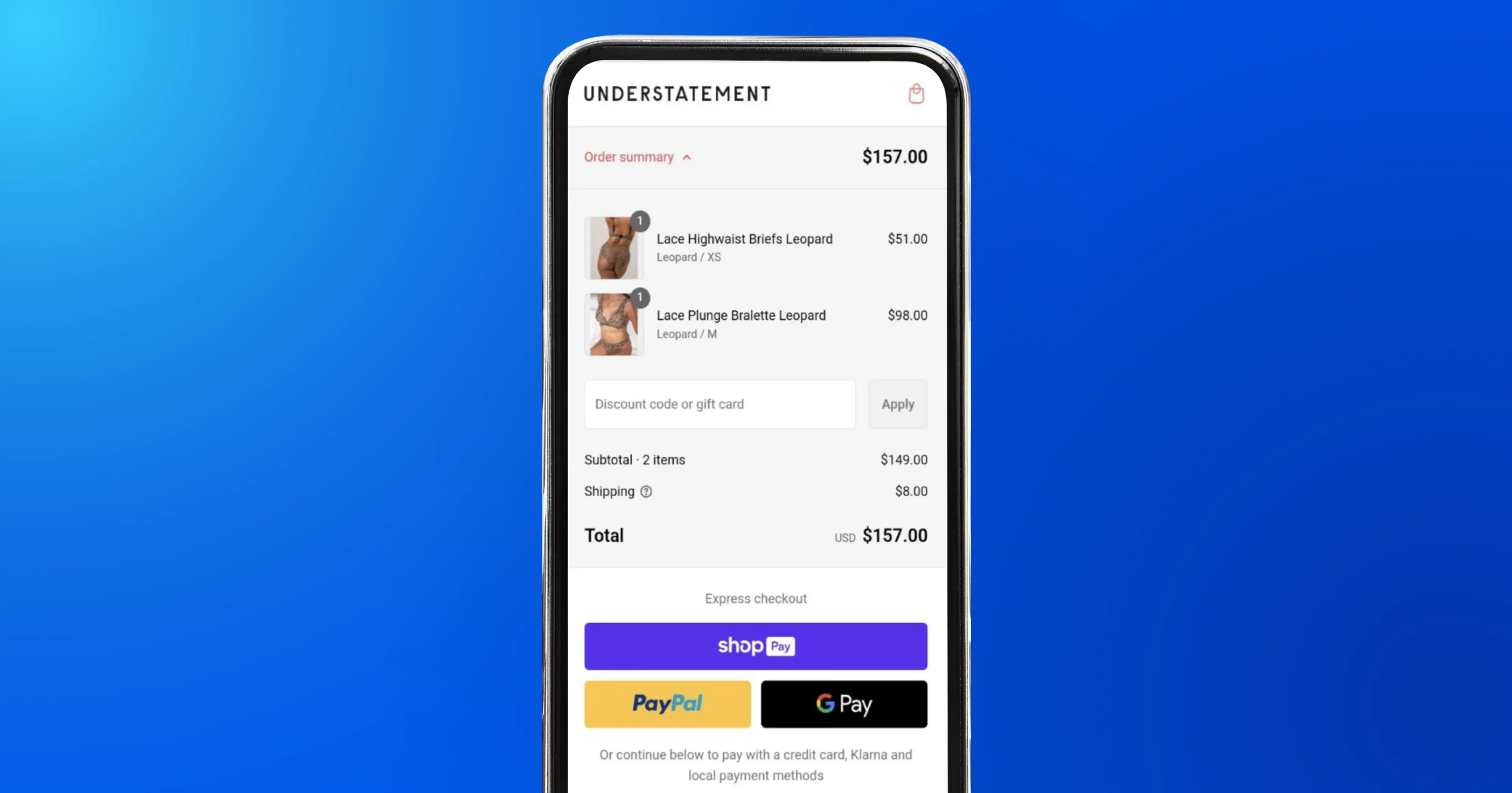
An example of a user-friendly checkout – Understatement Underwear, our client’s site.
The last stage of the conversion funnel is checkout, and the friction at this stage is the direct cause of cart abandonment. The checkout process is the most critical part of ecommerce design best practices. Long forms to submit, time-consuming account registration, and prices that are not clearly stated confuse users and make them leave. Guest checkout eliminates unnecessary barriers, minimal forms decrease cognitive load, and progress indicators eliminate confusion about the steps remaining. Open pricing and various shipping arrangements build trust, and users are assured that their shipment will arrive when they need it.
Key guidelines to follow:
Provide a guest check-out to eliminate obstacles.
Minimize form fields to essential information only.
Add progress markers for multi-step checkouts.
Display the overall prices upfront, including taxes and shipping.
Offer flexible delivery and return options.
5. Develop compelling product pages
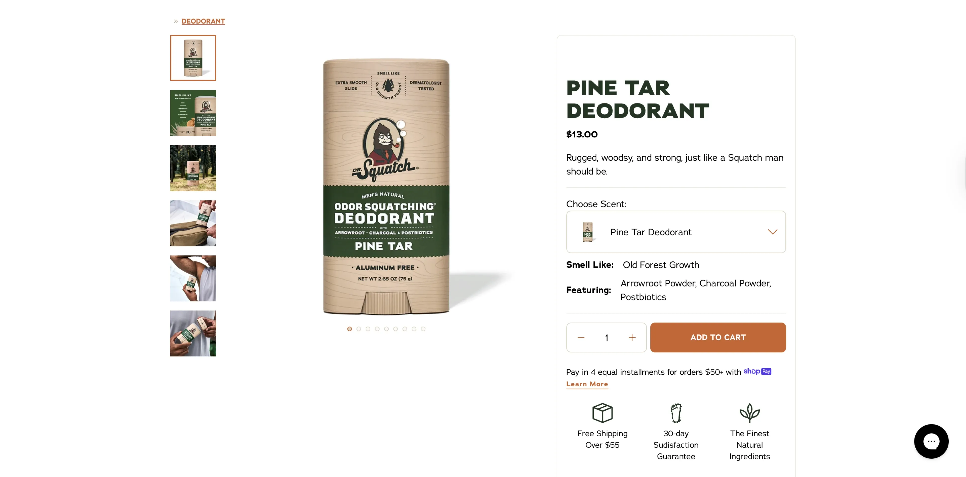
Your product pages should inform and convince simultaneously. Users rely heavily on visual and textual information when making purchasing decisions. High-resolution images, zoomable photographs, and 360° views deter uncertainty and drive returns. Brief explanations are also benefit-centric, clearly conveying a product's value and highlighting a specific feature with icons or color accents. Organised product information below the fold enables informed choices without overwhelming users. The slight animations can be used to make interactions dynamic, without distracting, and will encourage users to engage.
As shown in the screenshot, Dr. Squatch’s product pages offers free shipping over $55 and 30-day sudisfaction guarantee.
Key guidelines to follow:
Include several pictures and videos above the fold.
Add 360° views or zoom-in functionality to minimize turnover.
Use bullet points and icons for key features.
Add simple animations to increase engagement.
Attach detailed specifications when they are under the fold.
Allow customers to earn rewards with every purchase.
Encourage users to subscribe to recurring deliveries and enjoy exclusive discounts.
Offer free shipping on subscription orders.
Dive deeper into what a good Shopify product page should look like and read our article – How to build an effective product page on Shopify.
6. Create powerful calls to action (CTAs)
CTAs are the entry point to conversions, leading users to the action you want them to take. A lack of clear CTAs can leave users feeling lost or uncertain, reducing the potential to convert. Text that provides action, like the "Buy Now" button, and visual prominence achieved via color, size, or hover cues will make users aware of and comprehend the intended action. Primary and secondary CTAs are separated with a visual hierarchy, allowing the user to follow through the choices without getting lost.
Key guidelines to follow:
Apply action verbs like "Buy Now" or "Get Started."
Enhance the visual appearance of buttons by using contrast and hover effects.
Assert a visual hierarchy: primary, secondary, fallback CTAs.
Ensure that CTAs are consistent across pages.
7. Build trust and display social proof
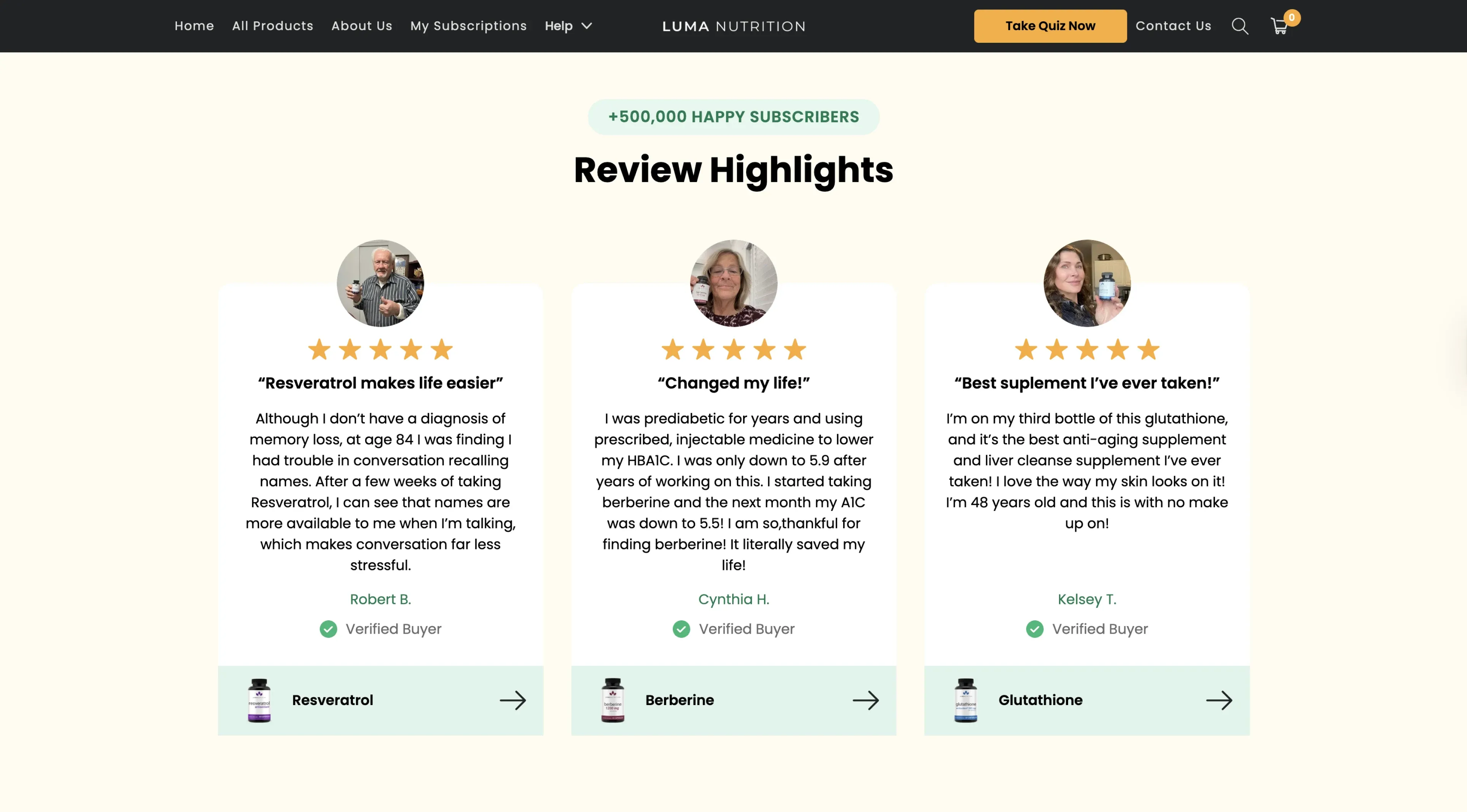
An example of a product reviews section – Luma Nutrition, our client’s site.
Customers are more likely to buy when they see proof that others trust your brand. Verified reviews, ratings, influencer endorsements, and press mentions create credibility and minimize purchase anxiety. A transparent refund policy and security badges reassure users that everything is secure, which is especially important for first-time users. A signal of trust throughout the site builds confidence in users, enabling them to feel safe as they make their purchasing decisions.
Key guidelines to follow:
Show verified reviews with photos and video clips.
Add influencer or press recommendations.
Apply trust icons such as SSL, safe payment, and guarantees.
Emphasize return and warranty policies.
8. Make information accessible to everyone
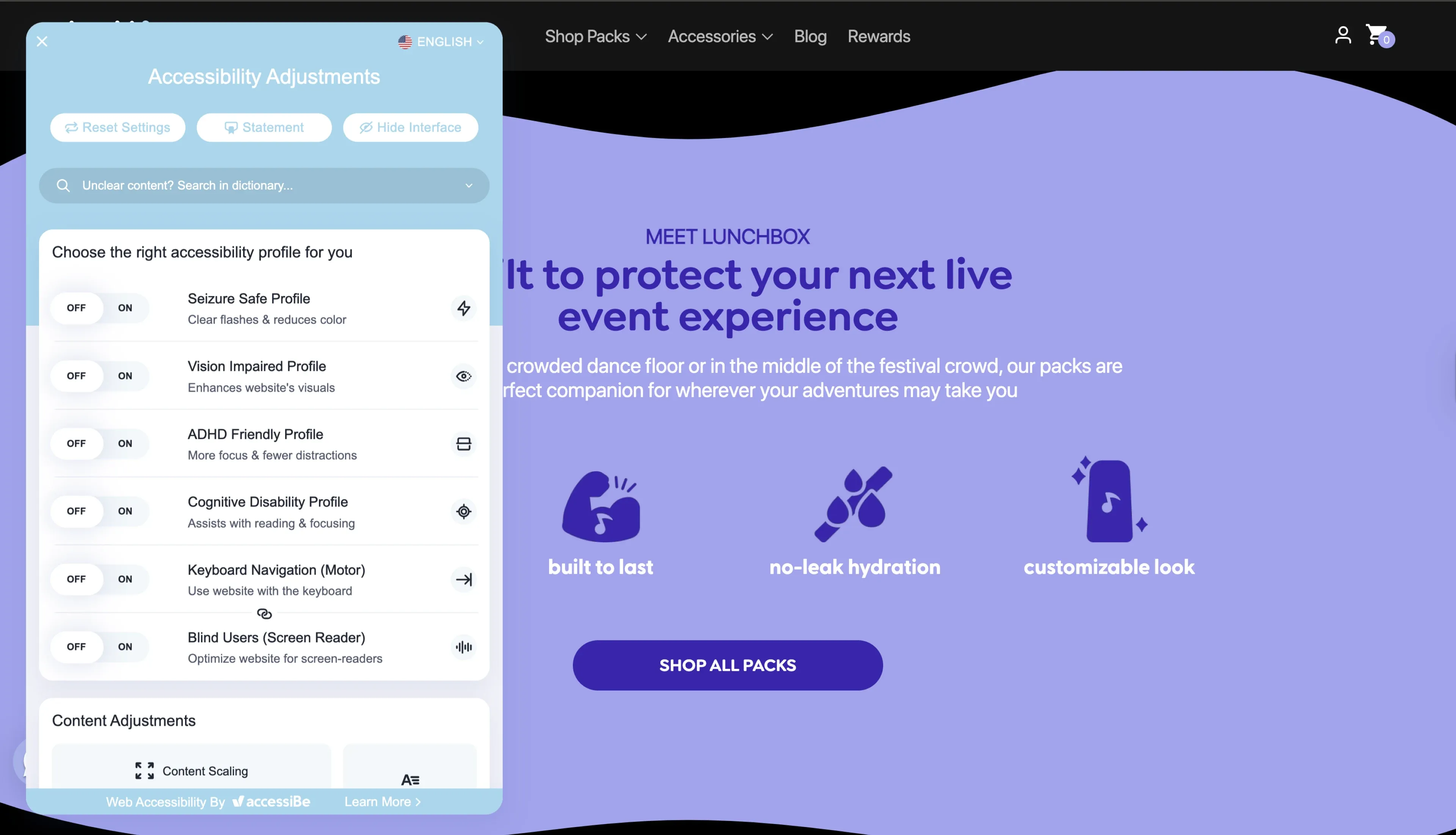
Here’s how our client, Lunchbox Packs, ensures website accessibility.
Accessibility is a cornerstone of ecommerce user experience as it’s essential not only for inclusivity but also for usability and legal considerations. Users with vision or hearing, or motor impairments should be able to navigate and purchase without obstacles. Accessible design enhances the overall user experience, as clear visuals, readable text, and intuitive navigation benefit everyone who uses the site, not just people with disabilities. Also, inclusive design can increase your customer base and mitigate legal problems in accessibility-compliant jurisdictions.
Key guidelines to follow:
Use fonts that are easy to read and have high color contrast to improve visibility.
Provide alt text for every image to make the content readable by screen readers.
Make it keyboard navigable for users who cannot use a mouse.
Avoid flashing or rushing content, as this can cause discomfort or provoke some health problems.
9. Display a wide variety of products on the homepage
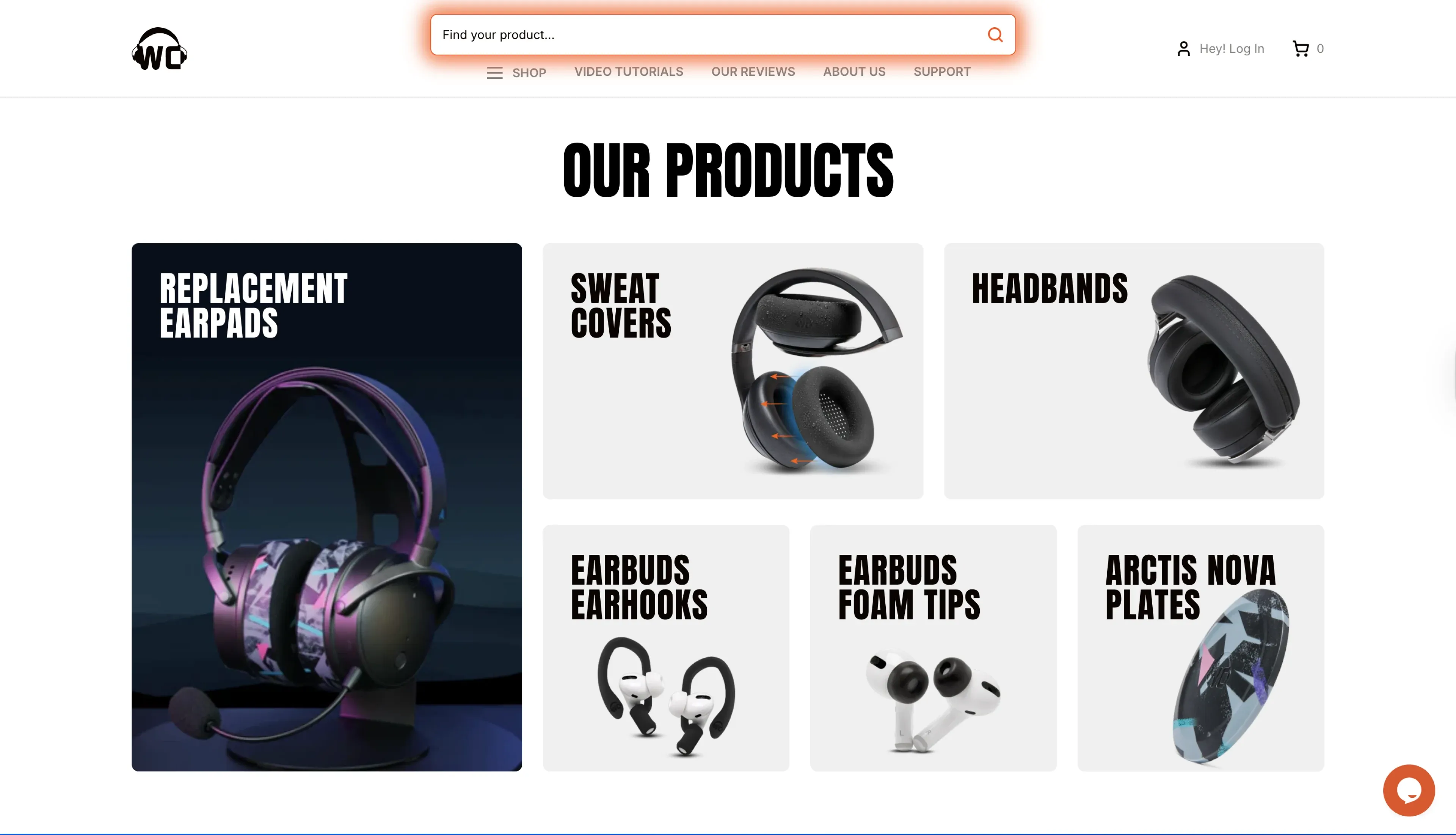
Our client, Wicked Cushions, displays products right on the homepage.
The home page, which displays only a limited number of products, may mislead users about your store's full assortment. Having a wide selection of product types will help users understand the variety you offer and prompt them to explore further. Include links in text on supplement thumbnails on mobile.
Key guidelines to follow:
Use at least 40% of the product types on the homepage.
Use both mobile images and text links to improve discoverability.
Rotate featured products to demonstrate the entire variety.
10. Consider adding a "Best Seller" category
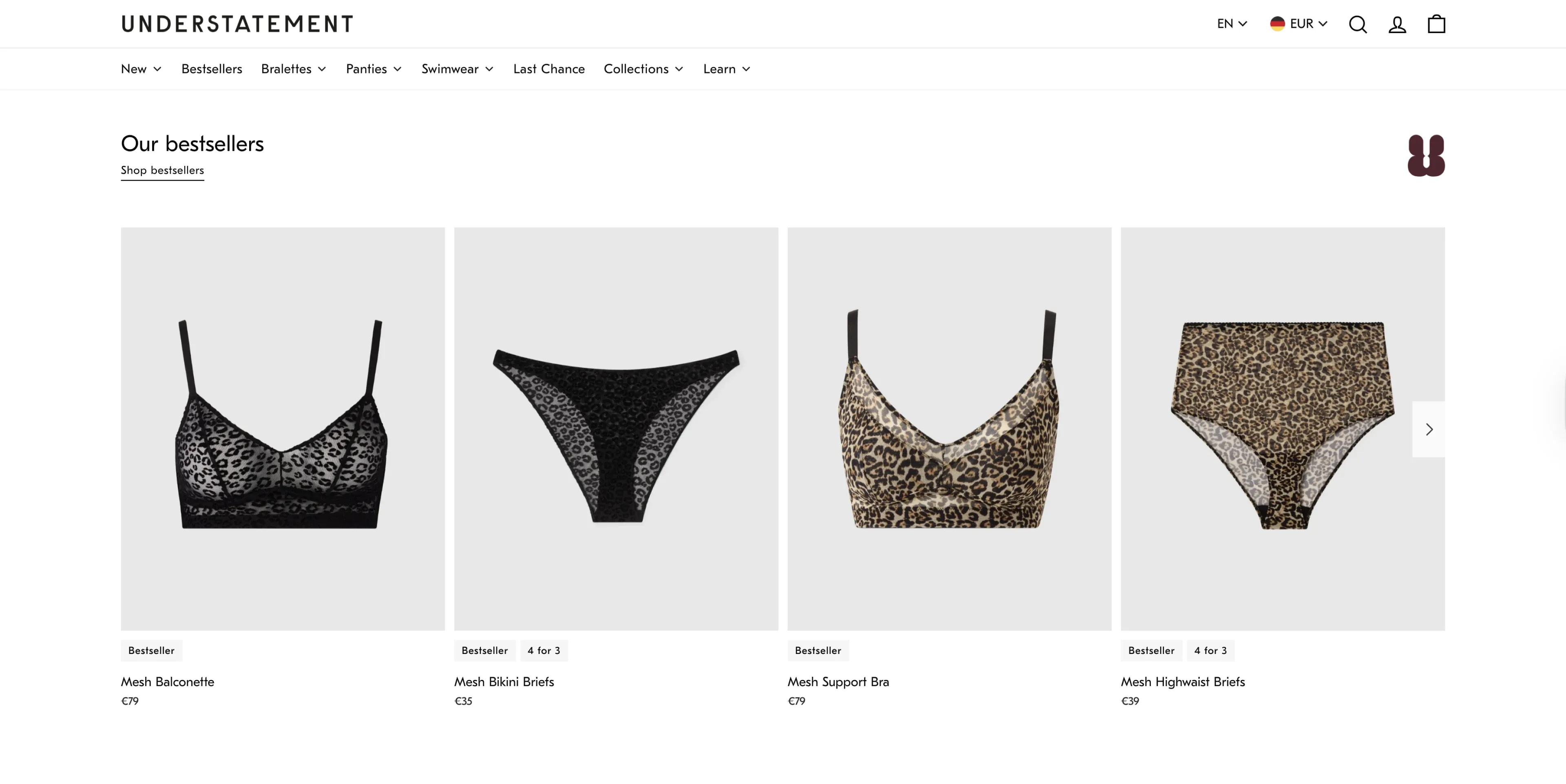
An example of the best-selling products category – Understatement Underwear, our client.
New users usually want to know which products are most popular. Displaying best sellers is a reliable starting point to dive into your catalog and may help users find high-converting items. This approach aligns with best practices for ecommerce website design, helping users build trust and make quicker purchasing decisions, which can be especially useful for young or new brands where customers may be uncertain about what to buy.
Key guidelines to follow:
Promote a “Best Sellers” section on the homepage or in category navigation.
Make sure the products are updated regularly to reflect current trends.
Use this category as an entry point for newcomers to explore your catalog.
11. Enhance self-service and account dashboard
It is necessary to have a transparent, well-designed account dashboard that helps establish trust and minimize user frustration. The customer wants all information about their accounts – orders, returns, shipping, and personal information – in one convenient place. A disorganized or unclear dashboard might result in redundant customer support requests and even cart abandonment, since people will not be sure or feel safe about their account status. Providing self-service features and clear organization empowers users, increases satisfaction, and encourages repeat business.
Key guidelines to follow:
Position “Account” drop-down menu in a consistent, visible place – usually the upper-right – so every user can easily access it, regardless of the page.
Display recent orders, order statuses, and milestones, such as shipping updates, to keep users informed without contacting support.
Give users the ability to print or email shipping labels directly from the dashboard, making returns and exchanges easier.
Use the “Apply” or “Save” buttons for edits to avoid accidental changes, ensuring every user action is premeditated and safe.
12. Personalize the experience
Relevance, engagement, and conversions are also enhanced through personalization, as users are offered products and recommendations that resonate with them. Suggestions based on personal data (e.g., browsing or purchase history) increase the average order value. Wishlists help users come back, and customized promotions make visitors feel recognized, increasing loyalty and repeat purchases. Personalization shows that your brand understands the customer, which enhances overall satisfaction.
Key guidelines to follow:
Recommend products based on browsing or purchase history.
Enable users to create wishlists or favorites.
Develop personal offers and promotions.
Re-engage users using targeted emails.
To wrap up
To summarize, the most effective ecommerce UX ecommerce best practices for boosting conversions and enhancing customer experience can be grouped into these key strategies:
Simplify navigation and search
Optimize for mobile
Enhance website performance
Make the checkout process smoother
Develop compelling product pages
Create powerful calls to action (CTAs)
Build trust and display social proof
Make information accessible to everyone
Display a wide variety of products on the homepage
Consider adding a "Best Seller" category
Enhance self-service and account dashboard
Personalize the experience
If you’re looking for more in-depth guidance or expert support, our Shopify development agency is ready to help. Don’t hesitate to get in touch with us, and we’ll deliver tailored ecommerce UX solutions designed to boost your sales and drive sustainable growth.
Frequently asked questions
How should you start designing a website for an ecommerce business?
Before you think about your color palette and typefaces, you need to:
Understand your target audience’s preferences.
Design and optimize your sales funnel – it will constitute the primary UX flows.
Outline your website’s structure and identify the page types it’ll include.
Create layouts for each page type that you’ll follow consistently.
Create a style guide for the entire website: primary and secondary colors, fonts, and font sizes for different types of text, and visual style.
Think through the navigation (menus, the search bar, etc.).
Keep in mind your website should look as great on mobile devices as it does on desktop.
When it comes to the hands-on design process, we advise you to start with the homepage, which will set the tone for the whole site. Then, design the catalog (or listing), product, shopping cart, and checkout pages.
What else can you do to improve your ecommerce website’s UX?
There are multiple UX ecommerce best practices for ecommerce websites, some of which will be more effective than others, depending on your target audience and business type. To further enhance your site’s user experience, consider:
Choosing pagination for listing and search results pages
Fostering trust through social proof elements
Decluttering your user interface
Adding multiple options for your users (contacts, payment methods, etc.)
How do UX improvements impact customer lifetime value (CLV)?
Improved UX drives repeat purchases, higher AOV, and customer loyalty, which in turn lead to greater CLV in the long term.
How does microcopy contribute to ecommerce UX?
Good, intuitive microcopy – form hints, tooltips, error messages, and more – will minimize friction and guide the user through the shopping process with ease.
How can UX design help reduce returns and refunds?
A clear description of products and specifications, along with high-quality images, helps set the right expectations, reducing buyer confusion and lowering return rates.
How can UX design adapt to seasonal ecommerce trends or promotions?
The changing layouts, CTAs, and visual hierarchy to highlight seasonal offers or popular products keep the experience relevant and boost conversions.
How does UX impact SEO beyond site speed and accessibility?
An effective UX will increase engagement indicators such as time on site, session depth, and a lower bounce rate, which search engines reward by ranking them higher.


Was this helpful?
0
No comments yet