
Shopify is the most popular SaaS platform for merchants worldwide — about half a million entrepreneurs in 175 countries empower their business on this platform. Shopify is an all-in-one platform that includes all necessary setups to launch an e-commerce website and start selling as fast as possible.
Shopify is a top e-commerce solution with a ready-to-use product inventory, customer base management, and third-party integrations. But you will also need custom website design, as it plays a key role in the high-quality operation of your online store. Good e-commerce design enables business owners to improve customer experience and increase sales.
Let’s take a look at the best Shopify store design tips that will help you to reach more customers.
Simplicity is the key
The primary goal of your e-commerce website is to encourage the user to make a purchase. Keep it really easy to your customers — follow common patterns and avoid cognitive overload. For example, your viewers shouldn’t search for a cart button. Most users are used to having their shopping cart on e-commerce sites in the top right corner. If it is located in another place, it might lead to an extra cognitive overload, and the viewer will turn away from your website without a purchase. Cognitive overload is a common issue of plenty of e-commerce stores. It happens when users are overloaded with information on the website. As long as users understand your website clearly and know how to interact with it, they are likely to buy.

Responsiveness to devices
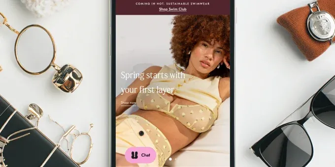
If you’re asking yourself a question “How to make the best Shopify website” then pay attention to website responsiveness to various devices. More than 50% of adults make online purchases via mobile phone in such countries like Canada, the United States and Europe. The design must look good not only on desktops, but on mobiles and tablets.
It is important to develop a responsive design, as it enables your customer to visit your site from different devices, like a tablet, phone or desktop. Still, many e-commerce stores don’t support responsive layouts. Be ahead of them — while implementing new pages, check out your design and functionality responsiveness on different devices.

Color palette is an advantage
Choosing the right color and color palette for the website is probably the most subjective part of creating a website design. The same color can evoke different emotions in different people. It depends on both personal preference and cultural background. By slightly changing the shade, you can make the color to be perceived in a completely different way. For example, take a website with healthy food and fresh products. Made in bright, rich green colors, it is associated with a healthy lifestyle. But by altering the color for a darker shade, we will raise doubt the freshness of the foods, as dark green is rather associated with spoiled veggies or fruits.

In order not to be mistaken with the color, it’s better to rely on the company's brandbook. It will showcase all corporate colors, their variations and application possibilities. This will help you pick the right colors quickly and accurately and achieve your design goals.
Unique branding
Users want to buy from established and reliable brands. That’s why it’s important to focus on branding. Branding is what makes you unique and memorable to the client. Below you can see a good example of branding that inspires customers to make a purchase. Limnia is a jewelry brand. Each piece is ethically produced in the Philippines. The design uses photographs of jewelry on ancient stones, which are timeless and stylish in our time. The pieces of jewelry are created so that you can wear them both in combination and separately. One piece of jewelry can turn into two: the necklace turns into two bracelets, the pendants turn into earrings. In order to give the viewer the ‘feeling’ of these jewelry pieces, the designers used fonts that transition from thin lines to thick ones. This feature sets this company apart from others.

Your brand should be the guiding spirit throughout all the pages of the site, appropriately reminding the user of which company’s products he wants to purchase. Whether it's a special element or a word in the logo carefully incorporated in your design, it will make you special. Find that flavor in your brand.
Product categories intuitive navigation
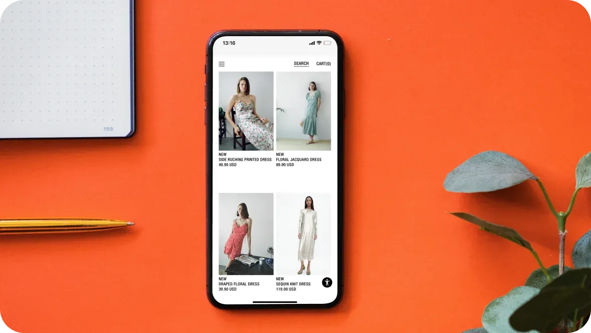
Product pages are a core component of the Shopify platform. Each product can belong to different categories, that’s why easy navigation is a must. If a user is forced to search for a product for a long time, go to many pages before finding the desired product, most likely, he or she will leave the site without making a purchase.
Categories navigation allows you to effectively present products in different and related categories, as users may not find the desired product in any single category. In addition to manually distributing products by category, for an additional fee Shopify provides the ability to use automatic distribution according to the following criteria:
Product title
Type of the product
Manufacturer
Price

Straightforward checkout
When the user is at the final stage of the purchase, there is no need to load him with a large list of questions. Checkout should be easy to understand, fast and painless for the customer. The more questions and information you will ask, the more you will force the shopper to quit and close the webpage.
To make the checkout process easy, it’s better to add default values, as well as a choice of pre-defined answers. You can add many things by default, for example, a country and city list, automatically defined payment systems, or the code of the telephone number. It is especially important to pull up the information that the user filled out earlier, such as First Name, Last Name, Email, so he will quickly complete the purchase stage. Even after the user has placed an order, it’s important to continue communication – show a popup “Thank you” banner, or the information about successful payment or the time of sending the delivery.

Necessary website testing
Testing the site helps to find out whether the site is understandable to users and whether the navigation is convenient. It also helps identify any errors on the site. There are several testing methods to help you improve your site's conversion rate. Here are a few of them:
In-person usability testing — when the user and the facilitator are in the same room, it is possible to ask the user questions and observe his actions.
Remote usability testing — similar to In-person usability testing, the only difference is that the user and the facilitator are not in the same room.
Unfacilitated usability testing — a kind of testing which is carried out without the participation of the facilitator. Users are provided with instructions on what actions they should take. Using this method, you can test the site with a larger number of users, since the presence of a facilitator near each user is not required. However, there is a drawback of the method – the facilitator does not ask questions and does not adjust the testing session.
In design, it is best to use testing which is carried out on real people, who can be asked different questions in the process, and immediately comment on their feelings from using the site. Such testing can be carried out at the earliest stages of website development, which will allow you to fix all errors at once.
A well-thought-out design for an e-commerce store can leverage sales. The main thing is to always think about the user and his user experience journey – not to overload with information, take care of his convenience, and give only the information that he really needs. Hopefully, these Shopify design tips will help you create awesome selling online stores.









Was this helpful?
0
No comments yet