


Lone Rider
Motorcycle equipment store theme customization case study of bringing the new "Motion" layout to life with mobile-first navigation, clearer PDP structure, and bundle-friendly buying.
Shopify theme customization tailored to the brand's updated vision
Location:
UK
Cooperation model:
Fixed price
Industry:
Partnership period:
August 2025 – October 2025
Improvements plan:
Shopify theme customization services, UI/UX design, Shopify integration, requirements and estimation analysis, testing, and delivery
Team size:
Shopify developer, Project manager, Account manager, Web designer
Technologies:
About the client
Lone Rider is an adventure motorcycle gear brand created for riders who live on and off the road, spend long days in the saddle, ride rough routes and face unpredictable weather. As stated by the founder, the brand was born to build the highest-quality gear for adventure riders, with no compromise between form and function. In that setting, equipment has to earn its place.
That's why the brand keeps things simple on purpose. Durable luggage, camp-ready gear, and practical accessories. All designed to take a beating and keep performing. No gimmicks, no unnecessary decoration, just utilitarian design, clear communication, and a strong connection with the adventure riding community.

Lone Rider’s decision to work with DigitalSuits
Lone Rider, as a motorcycle equipment store on Shopify, already had an internal development team, but they needed help with design, so they turned to DigitalSuits. However, they brought us in for a specific reason: to shape their store's Shopify web design so it matched with their brand's next stage, while remaining realistic and building on their existing concept.
They weren't looking for "pretty screens" for their motorcycle equipment store on Shopify.They wanted a UI that could be built mostly within the theme, with minimal custom Shopify development, while still feeling intentional, consistent, and scalable.

What prompted them to reach out:
- A clear product direction. Lone Rider already had the Motion theme in place. Their initial request was to perform a full theme upgrade while sticking with Motion, and to refine the design of key pages by leveraging the theme’s default features as much as possible.
- A build-first mindset. The plan was to rely mostly on the theme's capabilities, avoiding unnecessary custom work.
- Need for practical design guidance. They wanted Shopify designers who understand implementation constraints, what's easy, what's risky, and what pays off in the long term.

Why DigitalSuits
- Design with development awareness. We could recommend layouts, components, and patterns that fit the selected theme and avoid unnecessary technical issues.
- Theme-informed decisions. We grounded the redesign in how their Shopify theme works and what it can realistically support.
- A structured redesign process. We could take their inputs and turn them into a cohesive system that the dev team could implement smoothly.


Challenges of the motorcycle equipment store theme customization
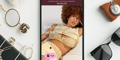
Lone Rider's website had grown organically over time, but key parts no longer supported how users actually browsed and bought complex motorcycle gear. The biggest friction points showed up on the homepage and product pages, where content volume and structure worked against clarity.
Homepage challenges
- The hero banner was overcrowded: video, text, and product messaging competed for attention.
- Too much text on the main page video, it weakened the core message.
- Featured sections felt crowded and inconsistent, making it harder to highlight what actually mattered.

Navigation and discovery
- The site relied on a complex product catalog, but navigation didn't fully support it.
- Users often had to leave the homepage to make basic selections, like choosing a motorcycle brand.
- Product cards lacked consistency, especially when stock labels or multilingual text shifted layouts.
Product listing pages (PLP)
- Category pages lacked a strong visual hierarchy.
- Filters existed but weren't clearly separated from sorting, making scanning harder.
- Product cards blended together, especially on multilingual versions, where text length varied.
- There was no clear way to visually highlight priority products or promotions.

Product detail pages (PDP)
- PDPs were the biggest pain point.
- Content appeared as long, uninterrupted blocks of text with unclear structure.
- Most products were sold as bundles with mandatory components, but option selection was hard to understand.
- Each PDP followed a different layout, making it difficult to define a reusable structure.
- Important content was there, but users had to work to read it, and many didn’t scroll far enough.
In brief, the site featured a wealth of useful information, but the way it was displayed made it difficult to take in, particularly on phones.

How DigitalSuits helped this bike equipment store on Shopify
We approached the redesign of the motorcycle equipment store on Shopify with one practical goal: to improve clarity and conversion. That meant our Shopify designer had to start working with the chosen Shopify theme wherever it made sense, and stepping in with targeted customization only where it couldn't support the experience the brand needed.

Homepage and navigation
We built a flexible mega menu that could grow with the catalog. We've turned it into a configurable structure with columns, links, and featured cards that could be rearranged without breaking the design. On mobile, we moved away from long dropdown patterns and designed navigation to behave more like a mobile app. Users move forward to deeper levels and back out again, rather than scrolling through a never-ending menu.

Product listing pages (PLP)
On PLPs, we tightened the browsing logic. We redesigned the product cards so translated labels with more characters don't break the layout. We also added a way to highlight key products among similar items, useful for promotions, hero categories, or bestsellers that deserve attention.

Product detail pages (PDP)
Within the motorcycle-focused equipment Shopify store, product detail pages received the most work and had the biggest impact. We upgraded the client's pages by following the best practices outlined in our article on the ideal professional Shopify PDP. We turned long, hard-to-read pages into structured layouts built from reusable sections. Instead of forcing users through a wall of content, pages became scannable: blocks, cards, and visual anchors helped people find what they needed faster.
For bundle-heavy products, we refined the configurator experience so option selection felt guided rather than messy. We also rebuilt Quick View to show only what matters for purchase decisions, and implemented a sticky Add to Cart pattern that keeps buying actions accessible without cluttering the screen. It is especially important when products include multiple required selections.

This cooperation wasn't just about the redesign, we left Lone Rider with layouts and UI components they can reuse for new pages and updates. We delivered a structured UI kit in Figma (with variables and components) so future pages don't start from zero. The end result stayed theme-aware but no longer theme-limited.
Where we added custom work (because the theme couldn't)
- Flexible mega menu structure (desktop + mobile behavior)
- PDP section system to replace unreadable long-form blocks
- Bundle-friendly purchase flow
- Quick View trimmed down to purchase essentials

Results
Lone Rider’s site became noticeably easier to navigate and more intuitive to shop from, particularly on mobile and on bundle-heavy product pages. The Motorcycle equipment store theme customization included a clearer PDP structure, which helped users move beyond the first screen and engage with product content.
This led to an increase in product page engagement and an uplift in add-to-cart interactions on key products. Also, bundle completion was up, so fewer people dropped off while choosing their options.

Improvements to navigation and category pages also reduced mobile bounce rate.At the same time, the use of filters on PLPs increased. Users now find and narrow down products more effectively.
It wasn't only about performance. Internally, it's simpler now. We left Lone Rider with a set of reusable blocks, so their team can tweak pages, launch new sections, and keep layouts consistent.
If your Shopify store isn't as easy to shop from as it should be, let's talk. We handle Shopify development and Shopify Plus development, and we'll help you sort priorities.


Shanique Jansen van Vuuren
Senior Project Manager, Lone Rider
5.0
"The quality of their deliverables is excellent."
Their knowledge of the ecommerce space is outstanding. What really sets them apart is their willingness to go beyond the brief - they proactively share expertise, offer suggestions, and give honest opinions that genuinely add value.
Frequently asked questions
Why did Lone Rider decide to work with DigitalSuits?
The client's motorcycle equipment store on Shopify needed support with Shopify website design. It had to be practical, theme-aware, and realistic to implement. They were not looking for a redesign detached from the build. They wanted a Shopify partner who could improve key pages within the Motion theme, keep custom development to a sensible minimum, and create a cleaner, more scalable user experience.
Did DigitalSuits redesign the store from scratch?
No. The work was built around Lone Rider's existing Motion theme. The goal was to get as much value as possible from the theme itself, then add custom work only where the default setup could not support the experience. That approach kept the redesign grounded and more efficient to implement.
What did Lone Rider gain beyond the visual redesign itself?
They did not just get refreshed pages. They also received a structured UI kit in Figma, along with reusable layouts and components that speed up future updates and ensure consistency. In other words, the project improved both the customer-facing experience and the internal workflow.