You need to increase conversions all the time to keep your ecommerce business performing. They aren’t the only metric that matters. Yet, they certainly make it to the top three. Higher conversion rates signal that your team does everything correctly. If conversions remain low for a long time, something’s not right with the strategy.
Conversion rates can provide insights into customer behavior, financial efficiency, and competitive tactics. Shopify store owners face numerous challenges when it comes to conversion growth. They can relate to a store’s technical aspects, user experience, brand perception, marketing efforts, and more.
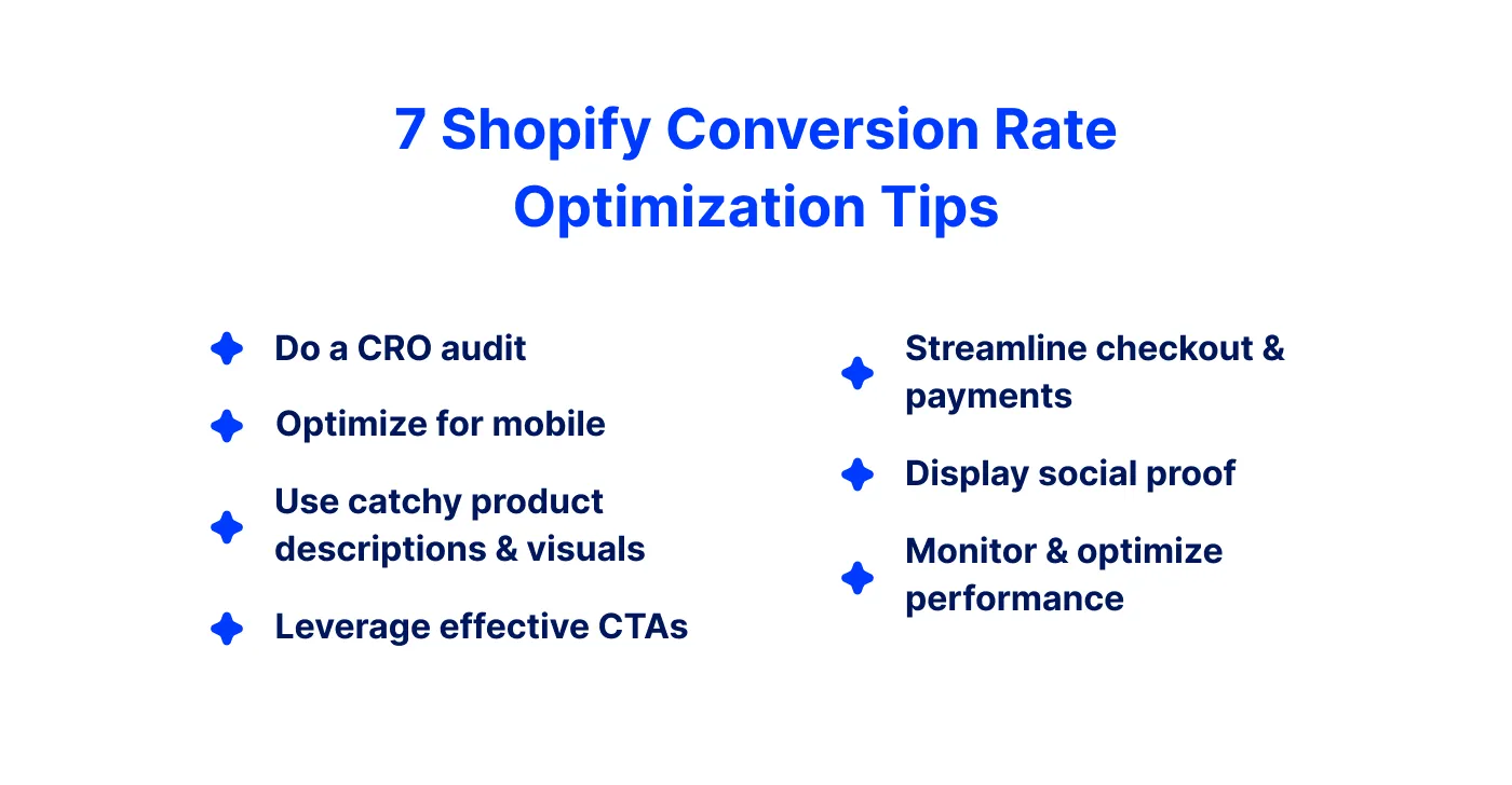
Navigating these challenges can be complicated. In this article, we’ll share tips to help you ensure conversion growth. These actionable tips are based on our team’s experience supporting ecommerce merchants. You can use it as a basic roadmap to address and solve conversion-related problems.
#1 Conduct a conversion audit
How to improve the conversion rate on Shopify? Start with gathering the data. The average conversion rate for Shopify stores is 1.3%. A 3.2% would put a merchant among the top 20% of best-performing stores. Those with a 4.8% conversion rate on Shopify can reach the top 10%. Shopify suggests that a baseline of 2.5% is a good place to start.
Analyzing current conversion rates
A conversion audit is a comprehensive review. It covers the store’s performance and helps identify areas for improvement. The process is not very complex. All you have to do is:
- Outline the data and metrics to analyze.
- Gather the data on the points above.
- Analyze user behavior on heatmaps and session recordings.
- Analyze conversion rates at all stages of the sales funnel.
- Compare different traffic sources for efficiency.
There are several tips that’ll help you make this audit efficient:
Prioritize high-impact areas. Focus on areas where small changes can yield maximum results, such as the homepage, product pages, and checkout process.
Compare your conversion rates and other key metrics against industry benchmarks.
Create detailed maps of the customer journey. Visualize how users interact with your site and where they face obstacles.
Conduct usability testing with real users. It’ll provide qualitative insights into their experiences and difficulties.
After the audit, you will have a comprehensive overview of the store’s performance. Based on that, you can start making data-driven changes.
Metrics and tools
Merchants can use a vast array of metrics for Shopify conversion optimization:
- Traffic: total visits, unique visitors, page views.
- Engagement: bounce rate, average session duration, pages per session.
- Conversions: conversion rate, cart abandonment rate, goal completion.
- SEO: organic traffic, keyword ranking, backlinks.
- Performance: page load time, time to first byte, mobile responsiveness.
- User behavior: click-through rate, exit rate.
The tools for tracking and analysis are even more numerous and diverse than metrics. The top-of-mind list and a good starter pack would include:
Google Analytics – a comprehensive tool for tracking website behavior.
Google Search Console – monitors your store’s presence in Google search results.
Hotjar – a user behavior analytics tool with heatmaps, session recordings, etc.
Crazy Egg – a visual analytics tool with heatmaps, scrollmaps, A/B testing, etc.
Optimizely – an experimentation platform for A/B testing.
SEMrush – an SEO and marketing analytics tool.
Ahrefs – an SEO toolset for link building and content analysis.
Since these tools are popular among marketers, you can find many guidelines and a vast user community. You can also expect support from the official customer care teams.
#2 Optimize website design and user experience
Design updates can boost conversions by up to 33%, as well as the optimization of the most visited pages and categories. Given that 68% of consumers shop from mobile devices, remember to optimize the website for smartphones and tablets. It’s essential to make design intuitive and appealing. Always stick to the user-first approach.
Importance of responsive design and mobile optimization
Responsive design guarantees the same shopping experience across all devices and expands your customer audience. To be more specific, responsive design and mobile optimization:
adjust layout and design elements, making navigation intuitive
guarantee that all UI elements are easy to interact with on a touchscreen
ensure convenience in viewing and interacting with page content
improve visibility and ranking in search results, driving more organic traffic
reduce the likelihood of users bouncing back to search results
make your store load faster, retaining more visitors.
Moreover, maintaining a single responsive website is more cost-effective. Managing separate sites for desktop and mobile requires more effort, time, and money.
Designing navigation, visuals, and interfaces
What are the cornerstones of user-friendly interfaces? Good UI includes clear navigation, compelling visuals, and helpful product descriptions. Let’s focus on the first two aspects for now.
Clear navigation means:
concise menu with minimum possible categories
logical item classification and grouping
descriptive and accurate labels for navigation links
using common terms that your target audience understands
easily located search bar with auto-suggestions
breadcrumb navigation with clickable path items
sticky menus that remain visible
essential links in the footer for easy access.
The main rule of clear navigation is avoiding overwhelming users. Look for a balance between informativeness and convenience. Also, let your users navigate back to previous pages and get to the homepage from any point of their journey.
Compelling visuals mean:
multiple high-resolution images of products from different angles
the consistent visual style, contributing to a cohesive look
using whitespace to avoid clutter and focus attention on key content
zoom on product images or 360-degree product views
videos demonstrating product features, usage, and benefits.
User-friendly design, as a whole, involves a balanced use of UI elements, colors, and imagery. The basic practice is using size, color, and placement to highlight important elements. Make CTAs, product images, and promotions visible. Design with touch interactions in mind. Compress images, minify CSS and JavaScript, and use efficient coding practices to ensure fast page loading.
#3 Leverage compelling product descriptions and visuals
One more strategy for Shopify conversion rate optimization is creating the right content. The top three trends marketers have been using lately are:
short-form videos (33%)
mobile-friendly design (32%)
content reflecting brand values (30%).
Videos and images are the media formats with the highest ROI. There are cases when adding the right photo doubled the conversions. In ecommerce, imagery and descriptions are essential not only for marketing materials. They are the core of the website, defining its success to a great extent.
High-quality content for increasing conversions
Content quality impacts how customers perceive the store and interact with it. Hence, it defines the way visitors make purchasing decisions on your site. Engaging content helps in several ways:
High-quality images provide a visual representation of the product. Including multiple images helps shoppers envision how the product fits into their lives. The visual clarity reduces uncertainty and builds trust.
Videos demonstrate the product in action. They better show how it works, its size, functionality, and benefits. Product demonstrations, unboxing videos, and customer testimonials answer questions that static images cannot. They address concerns and build trust.
Interactive content offers an immersive experience. It can include 360-degree views, AR features, and various customizations. These elements allow customers to interact with products, mimicking in-store interactions. Such engagement makes shopping more enjoyable. It also reduces return rates by setting realistic expectations.
High-quality content in all forms creates a rich, informative, and engaging shopping experience. It helps capture customer attention, keep them online for longer, and guide them toward making a purchase.
Strategies for creating persuasive product descriptions
Knowing your audience is significant to create the narrative that resonates with it. Brand voice aside, there are some general rules for making product descriptions appealing:
Provide all necessary technical details and specifications.
Present technical information in an easy-to-understand format.
Avoid too much technical jargon.
Address the customer using “you” to create a personal connection
Use words that appeal to the senses to help customers imagine the product in use.
Keep the texts clear, concise, and well-structured.
Use strong, action-oriented language that evokes emotion and action.
Highlight benefits, not only the features. You can use a separate page block for this.
Mention guarantees, warranties, and return policies to reduce perceived risk.
Share testimonials or endorsements from satisfied customers or influencers.
Expect and address common objections or questions.
Use high-quality images that show the product from different angles.
Include videos or demonstrations to provide a better understanding of the product.
Descriptions that boost conversion rate contain accurate information, are helpful, and create an emotional appeal.
#4 Implement effective CTA strategies
CTAs surrounded by white space can increase conversion rate by 232%. Changes in CTA design can also help improve conversions. Sometimes, it’s a 30% or 60% growth, but the results vary greatly. Personalizing CTAs or changing their position can boost conversion rates as well. So, let’s take a look at how you can work with calls to action.
Creating compelling CTAs
How to encourage visitors to buy from you? The best practices for designing effective CTAs don’t require anything complicated:
Use direct commands and active verbs. For instance, “Add to Basket” suggests what users can do and encourages immediate action.
Announce your value proposition if possible. For example, “Claim the Discount” clearly conveys the benefit.
Use words and phrases that create urgency. Highlight limited availability or exclusivity to persuade a user to make a purchase.
Make CTAs stand out visually. Use colors that stand out against the rest of the page. Ensure the CTA is placed strategically and is convenient to click.
Maintain simplicity by using short and specific text to avoid clutter.
Personalize when possible. Use different texts based on user behavior, preferences, or demographics. - Try dynamic CTAs tied to the customer journey stages.
These simple practices will help you create effective CTAs, capturing your audience's attention and driving them to take the desired actions.
A/B testing and optimizing CTAs
Comparing two versions of a CTA helps you determine which one performs better. Running these tests includes several steps:
- Decide what elements you want to test. It can be text, color, size, or placement.
- Develop two versions of your CTA. Each variation should change only one element.
- Show each version randomly to a similar segment of your audience.
- Track click-through rates (CTRs), conversions, and user engagement for each variant.
- Look at which version performs better and use it on your pages.
Conduct separate tests for different pages or page categories. Remember to conduct A/B testing regularly to adapt to changing user behaviors and preferences.
#5 Streamline the checkout process and payment options
Let’s start with some statistics prepared by Baymard Institute:
The average cart abandonment rate is 70.19%.
22% of users abandon their carts when the checkout process is too long or complicated.
26% don’t want to create accounts when buying items.
25% don’t trust a website with card information.
21% don’t finish a purchase if they don’t see the total costs upfront.
With this in mind, a very straightforward answer to the question “How to increase the conversion rate on Shopify?” is “Make it easy to buy things”. Find out more on how to streamline the checkout process and payment options from our article.
Tips for reducing cart abandonment rates
The most apparent solution to minimizing cart abandonments is to simplify the checkout process. For this, reduce the number of steps required to complete a purchase, use a single-page checkout, offer a guest checkout option, and avoid forcing users to create an account. Other tactics include:
displaying security badges and certifications
fully optimizing the checkout process for mobile devices
optimizing page loading speed
displaying all costs, including taxes, shipping, etc. upfront
offering various payment options
requesting only essential information
offering autofill and form validations
sending follow-up emails and showing retargeting ads
allowing customers to save their cart for later.
If you need professional help in implemeting these techniques, try our Shopify CRO services. Completing the purchase should take minimum time and effort. It should also accommodate user preferences on data sharing and payments. It will inspire trust and help turn more abandoned carts into completed purchases.
Optimizing the payment experience
Let’s wrap it up with a few words about payments specifically. A few things are a must if you want to increase website conversion:
transparent pricing with all costs calculated and displayed before charging a user
currency options, preferably the client’s currency included
multiple payment methods, including local and international banks and systems
secure transaction encryption
ability to save payment information in the account
secure storage of such information.
The task is to make payments transparent, flexible, and secure. Those who don’t understand the pricing policy won’t consider your store trustworthy. Those who cannot use a preferred payment method won’t come back. Needless to say, ensuring security is paramount.
#6 Leverage customer reviews and social proof
Just imagine, 98% of consumers consider reviews critical for making purchasing decisions. Over half of shoppers check reviews online while shopping in a brick-and-mortar store. People pay attention to the average star rating and visit review platforms. Almost half consider five-star reviews suspicious. Nearly all consumers (96%) look specifically for negative feedback.
What does it mean for merchants? Customer reviews are necessary to increase conversion rate Shopify. Having a feedback mechanism in the store is crucial.
Importance of customer reviews and testimonials
Customer reviews and testimonials build trust and credibility. Numbers aside, user feedback influences purchasing decisions in several ways. Reviews and testimonials:
act as social proof, showing the experience people had
provide an authentic and persuasive perspective on the product
reduce uncertainty, attracting more attention and engagement
improve SEO through user-generated content on product pages
show transparency, which contributes to the brand’s credibility
confirm good customer service and commitment to addressing concerns.
Encouraging customers to leave reviews and makes them feel valued. It increases brand loyalty and the likelihood of repeat purchases. There’s also an added value for business planning. Reviews can highlight issues and areas for improvement and bring unexpected insights.
Strategies for encouraging customer feedback
How to encourage positive customer feedback? To start with, make a review block on each product page easy-to-find. Consider adding visual reviews and testimonials. Photos and videos of the products are even more persuasive than texts.
Showcase endorsements from influencers or industry experts. Discuss bonuses and discounts for users who leave reviews. And don’t forget about Shopify integrations that can help you collect reviews.
#7 Monitor and optimize your store’s performance
Conversion rate optimization on Shopify starts with learning how your store performs. Constantly tracking your store’s performance is the only way to align with the market trends and purchasing tendencies. Having access to performance data enables you to draw objective conclusions about your store's effectiveness. It will also help you build or adjust the existing business strategy.
Tools and analytics for performance tracking
Here’s a list of some of the most popular and effective tools for performance tracking:
Shopify Analytics
Google Analytics
Hotjar
Klaviyo
Crazy Egg
Lucky Orange
Facebook Pixel
Google Tag Manager.
The list is far from complete. Each solution lets you look into conversion rates, traffic sources, and customer behavior.
An iterative approach to continuous improvement
What is an iterative approach to Shopify conversion rate growth? It involves regular testing, analysis, and optimization of your store’s elements. It ensures that you keep refining your strategies based on data-driven insights. As a step-by-step process, it looks like this:
- Establish baseline metrics. Use special tools to understand your current performance. Define KPIs to aim for.
- Identify areas for enhancement. Check and analyze customer feedback, behavior, and funnel.
- Hypothesize changes. Think about what changes could improve Shopify conversion rate. Prioritize your ideas.
- Run A/B testing. Create different versions of your web page elements for each hypothesis. Conduct tests for several weeks and make changes based on testing results.
- Gather feedback continuously. Keep collecting customer feedback. It’ll help you stay informed about any new issues or opportunities.
- Repeat the process. Analyze the insights from each round of testing. Form new hypotheses and begin the process again.
Finally, keep up with industry trends and new technologies. Watch your competitors. Hold brainstorming sessions with your team. It’ll help you gain fresh ideas and find ways to realize them.
To wrap up

You need a mix of strategic changes to increase Shopify conversion rate. And this optimization is not a one-time thing. It is ongoing. We’ve covered the main ways to increase conversion rate. In brief, it’s all about keeping the user experience simple and convenient.
Start by simplifying the purchasing flow. Wrap it up in an appealing and intuitive design. Optimize the store for mobile users. Offer various payment options. Show reviews and encourage customers to leave some. Building trust with transparent pricing and ensuring security. Use tools to analyze the store’s performance. Run A/B testing and experiment.
These strategies will help you create a more engaging shopping experience and ultimately lead to higher conversions. If you need to boost conversions and grow your ecommerce business, don’t hesitate to contact the DigitalSuits team. We’ve been developing and supporting Shopify stores for over 8 years. We’ve learned all the ins and outs of conversion enhancement on this platform, so we know for sure how to get you the expected outcomes.


Was this helpful?
0
No comments yet