
Optimizing your Shopify store for the surge in mobile shopping is crucial. Previously, shoppers would browse on mobile devices but complete purchases on desktop computers.
Today, with the increasing prevalence of mobile shopping, users are more comfortable making purchases directly from their phones. Shopify mobile speed optimization should be a top priority if you're looking to boost sales. Here are key reasons why:
In 2023, approximately 30% of internet users who shopped weekly made their purchases using a mobile phone.
By 2027, mobile shopping for the U.S. market will reach $856 billion, accounting for an essential part of ecommerce sales.
Recent surveys showed that about 76% of adults had made purchases using their mobile phones.
To attract mobile users, make sure your mobile site loads as quickly as possible. Here’s a guide on how to optimize Shopify for mobile users, along with tips for delivering an experience comparable to that of desktop users.
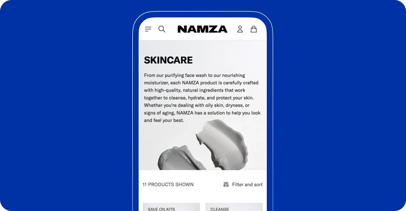
Keep the navigation bar accessible
A well-designed navigation panel greatly enhances the user experience (UX) by making it easy for users to find exactly what they need. When navigation is intuitive and organized, users can quickly access content or products, leading to reduced bounce rates. If visitors don't have to struggle to locate what they are looking for, they're more likely to stay on the site, explore further, and potentially convert into customers. A straightforward, easy-to-use navigation system improves usability, increases time spent on the site, and boosts conversion rates.
To create a seamless experience for all users, ensure the following:
Intuitive layout: Keep the menu simple with clear labels and organized sections so users can easily find what they want.
Consistent positioning: Place the menu in a consistent location (usually at the top or side) so users know where to expect it on every page.
Responsive design: Use dropdowns or a hamburger menu for mobile views to keep users engaged and avoid losing them during navigation, and mix scrollable content with tappable elements.
Clear and descriptive labels: Use brief but descriptive names for each menu item, helping users quickly identify where each link will take them.
Highlight active pages: Highlight the current page or section by marking the corresponding menu item clearly. This helps users know where they are on the site.
Accessible design: Ensure your menu meets European Accessibility Act requirements and WCAG standards for smooth browsing, including screen readers and keyboard navigation.
Fast loading time: Keep the navigation bar lightweight and optimized for fast loading.
When browsing or comparing multiple products, users should be able to access the navigation bar with a single tap. The navigation bar should work smoothly on all devices and screen sizes.
Optimize visuals for mobile screens
Optimizing your Shopify store speed and performance is one of the most essential questions that arise before and after your storefront is set up. Site speed influences not only user experience but also your Google ranking and conversions, which makes it a crucial point to consider when investing your time and effort in Shopify speed optimization services.
If you're wondering how to increase Shopify store speed on mobile, consider various strategies that can enhance performance and improve user satisfaction. Resizing large image files is one of the most effective ways to improve site speed on mobile. In reviewing numerous Shopify stores, we've noticed many businesses tend to use a large number of images, which makes sense since images are essential for ecommerce, especially in sectors like retail where showcasing products visually is crucial.
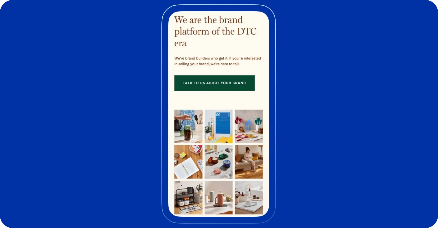
While images are great for enhancing your store's user experience and branding, they often come at the cost of performance. Image files are typically much larger than HTML or CSS files. Using too many images on a page can result in poor mobile speed and increased download times compared to pages with fewer images.
Uncompressed images can lead to performance issues. Many Shopify stores upload images without compression, resulting in unnecessarily large file sizes.
For image compression, we recommend a combination of the following methods for improving the site speed on mobile:
Shopify Apps: Some apps automatically compress images upon upload and optimize them for faster loading times without sacrificing quality. There are specific apps like Crush.pics and TinyIMG that are quite popular among merchants.
Optimizilla: This tool lets you manually compress large image files before uploading them to your site.
Even with a great Shopify theme, mobile designs can sometimes look off if the site was built mainly for desktop use, which is often the case. Avoid this by ensuring Shopify displays responsive images for a smooth mobile experience.
A responsive design isn't just about fitting everything on a smaller screen – it’s about proper adjustments to media elements. For mobile optimization, check how images are cropped, the size of banners, and how videos or rich media display. If product images appear pixelated or banners cut off key content, it could impact how visitors perceive your site.
Improve CTA Buttons
CTA buttons can make or break a sale, so it’s important to get them right. First, make sure mobile buttons are easy to tap. For Shopify mobile optimization, labels also have to show clearly where the button leads. This helps users understand what to expect when they click the button, improving their experience.
Here are key tips for designing effective mobile buttons:
To ensure easy tapping, buttons should be at least 48x48px. Fingers, especially thumbs, aren’t always precise, so don’t be afraid to make the buttons bigger.
Use rectangular buttons with rounded corners for a friendly, familiar look.
Make primary buttons bold and noticeable; secondary buttons should be less prominent.
Make sure your button colors stand out with a contrast ratio of at least 4.5:1 between the button text and its background.
Use subtle shadows to create depth without overwhelming the design.
Differentiate button importance through size, color, and contrast.
Maintain at least 12px of space between buttons to avoid misclicks.
Provide visual feedback, like color changes, when buttons are tapped.
Position primary buttons where users expect to find them, like at the bottom of the screen.
Make sure button labels clearly show what the button does. Instead of using vague terms, choose specific phrases that explain the action, like "Add to Cart" or "Sign Up."
Keep the design and functionality of buttons the same across your website.

Try testing fixed CTA buttons (which stay in one spot) versus sticky ones (which move as you scroll) to see what works best.
Mind your pop-ups!
If you are looking for Shopify mobile speed optimization, you should be careful with pop-ups. They can be very annoying and ruin the user experience. Pop-ups often take up the entire screen and can be hard to close, frustrating users. Instead of helping, they might drive people away. Also, users might accidentally sign up for things they didn’t want.
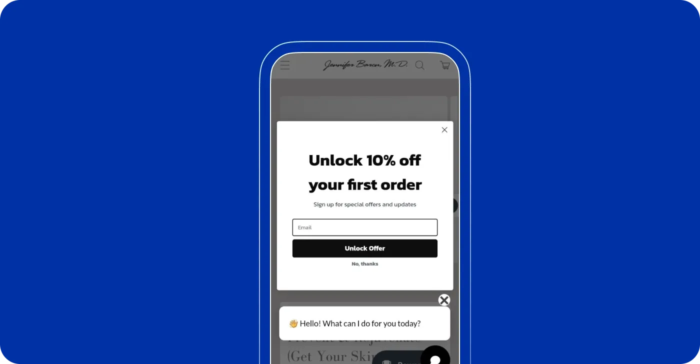
Their main aim is to capture the attention of a website's visitors and prompt them to interact with the brand but not frustrate them. It's best to design pop-ups carefully so they don’t get in the way of browsing.
Here are some practical tips for your attention:
Choose the right pop-up type and position. Use standard-size pop-ups with a clear close button. They are less intrusive and work well when welcoming users or offering discounts.
Prioritize correct targeting. Show pop-ups to users who are genuinely interested in your offer. Also, limit pop-ups to relevant pages. For instance, invite users to book a demo only when they are interested in comparing products.
Nail your CTA. Use a stylish, prominent Call-to-Action (CTA) button. Keep your message straightforward (e.g., “Get 10% off”). Ensure the button is large enough for easy tapping and stands out from the background.
Avoid using images. Limit images in mobile pop-ups. Too many visuals can distract from the CTA.
Add fewer form fields. Keep it simple and ask only for essential information, like an email address.
Ensure compatibility and user-friendliness. This will let you increase the likelihood of users signing up. Test the form across various mobile devices to ensure it displays correctly.
Use the visible close button. Make sure the close button is easily accessible and not hidden.
Consider alternative options. Adding a “No, Thanks” button under the CTA may be a better option for easy dismissal.
Use team input or QA testing. They will let you catch any display issues and maintain a smooth user experience.
Optimize font size for mobile readability
Choosing the right font sizes for mobile optimization isn’t an exact science. Here are some steps to guide you in your design process:
- Body fonts should be 16-20px:
Different fonts, even at the same size, can look very different. For instance, Futura may seem much smaller than Proxima Nova at 16px, affecting readability.
Depending on the nature of your site, whether text-heavy or interaction-heavy, your approach may vary.
- Rule of thumb: Start with a default size of 17px and adjust based on context.
Adjust down if:
You need to display more information within mobile widths.
Lines are too short (less than 30 characters), causing excessive eye movement.
Adjust up if:
Users must read longer paragraphs.
Text appears too small for comfortable reading (it should match the ease of a well-printed book).
- Consistency is key: Stick to your default font size for body text, menus, lists, form controls, and labels. A common mistake in UI design is using too many different font sizes, which can lead to confusion.
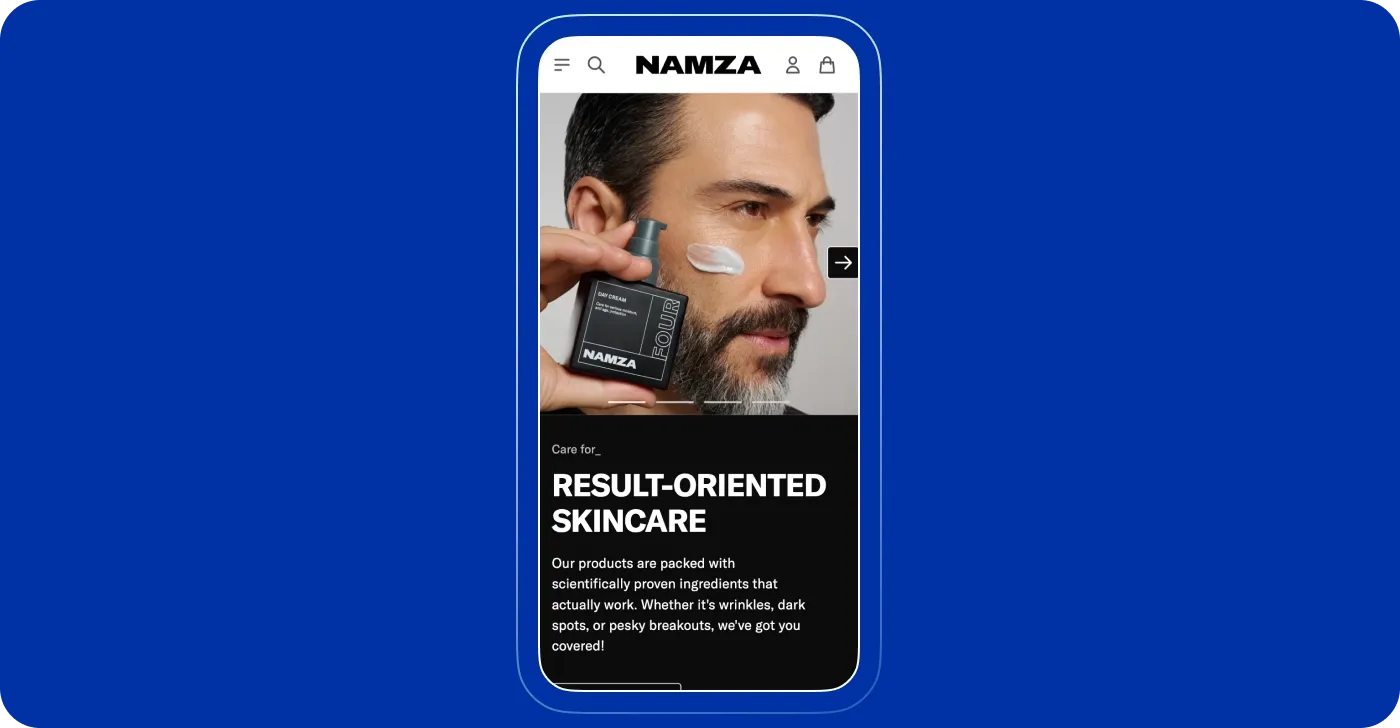
- Avoid outdated fonts: Times New Roman at 12-point is outdated for mobile. Users often need to zoom in to read small text, which is inconvenient. Instead, opt for larger, more modern fonts. Sizes around 14 to 16 pixels (or one rem) improve readability on small screens.
- Some considerations for larger font sizes. While increasing font size enhances readability, take into account that it may affect your layout. For example, larger text can complicate mobile optimization, especially in multi-column formats, where it could limit the number of words per line, making it harder to read. Adjust your design so that columns stack vertically to prevent layout problems on mobile devices. At the same time, on a desktop, you can keep the original column format for better use of space.
Think about text length
People usually scan rather than read everything carefully online, especially on mobile. Besides, mobile users are often on the go, so long paragraphs can be overwhelming and difficult to read on smaller screens. Since Google prioritizes mobile-first indexing, it's important to ensure that all essential information from your desktop site is also available on the mobile version.
To make your content easy to scan and ensure mobile optimization for Shopify:
Break content into smaller sections
Keep paragraphs short
Use bullet points or numbered lists
Include videos or animations to explain complex ideas.
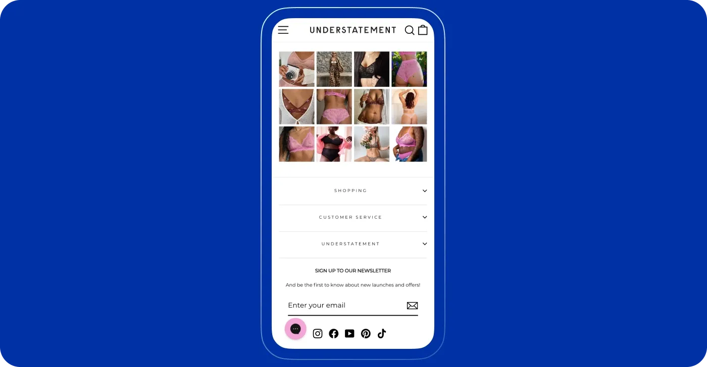
If you have a lot of details, consider using accordions (collapsible sections that expand when clicked) to avoid overwhelming visitors with long blocks of text.
Optimize the mobile checkout page
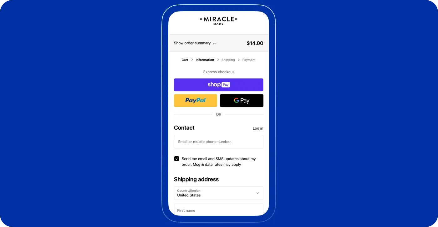
Making your checkout process mobile-friendly is crucial, especially when considering how to speed up a mobile site on Shopify. Here are key points to improve the mobile checkout experience:
Offer multiple payment options, including digital wallets and local payment methods, to increase convenience.
Use a clean, minimal design with a simple layout and ensure buttons have enough contrast to stand out.
Limit information requests to essentials only to respect customer privacy and speed up the purchase process.
Consider auto-filling fields where possible to save time.
Make the checkout button visible to make it easy to locate on your website.
Optimize checkout page load time by reducing any unnecessary scripts or elements that might slow it down.
Offer guest checkout: Allow customers to complete their purchase without creating an account.
Reduce redirects and fix broken links
Minimize redirects to avoid unnecessary page load delays. To provide efficient Shopify mobile optimization, regularly scan for broken links and fix them to improve user experience and prevent lost traffic.
Check for broken links: Use online tools or Shopify apps to find and fix broken links and ensure visitors aren’t sent to dead pages.
Audit redirects: Review and remove any unnecessary redirects. For permanent changes, use 301 redirects to maintain SEO value; for temporary ones, use 302 redirects.
Optimize internal linking: Ensure your internal links are working properly and lead to relevant, updated content.
This will help speed up your Shopify mobile site and reduce user frustration.
Keep an eye on your store’s performance
For effective mobile optimization, regularly track your store’s performance with tools and Shopify’s built-in reports. These offer insights into key areas like page load times and mobile-friendliness. This step will guide you on how to optimize Shopify for mobile and ensure a smooth user experience:
- Check load speeds often: Test your site on mobile devices to make sure it loads quickly. Aim for under three seconds because slow loading can make visitors leave your site.
- Watch user experience: Look at how users are interacting with your site. Pay attention to their feedback and see if there are any issues that need fixing.
- Track your results: Keep a record of your performance numbers to find trends and areas that need improvement.
- Make changes based on data: Use the information you gather to make smart adjustments to your site’s design and features.
- Test your updates: After you make changes, test your site again to see if the updates have improved performance and usability.
- Repeat the process: Make this a regular routine so you can keep improving your mobile site using real data.
Tools to check mobile page speed
There are many tools to test mobile site speed. Here we'll cover some of the most popular used by web developers for mobile optimization:
Google’s PageSpeed Insights is a free tool that analyzes your website's performance on both mobile and desktop platforms. It assigns a score out of 100 and offers actionable recommendations for improvement. Just enter your website's URL, and it will produce a detailed report highlighting areas that need optimization.
Lighthouse is a web performance audit tool that is available as a browser extension or within Google Chrome DevTools. It evaluates various metrics, like loading time, accessibility, and mobile SEO, and gains insights into improving your site's performance.
GTmetrix will test your site across browsers and locations and provide detailed performance metrics. Using this tool, you will analyze historical data and evaluate the impact of your optimizations over time. Among main features and benefits:
Speed and performance analysis
Testing across different browsers and locations
Actionable optimization suggestions
Historical data for performance tracking.
Pingdom Website Speed Test is an effective tool to get data on your website’s speed. It covers performance grades and detailed insights into load times, page size, and the requests made by the site on mobile devices. Based on this data analysis, you can identify and prioritize the areas for improvement.
Real User Monitoring (RUM) tools provide a clear picture of real-time user interactions. By using such tools as Google Analytics, you gain valuable insights into load times and performance that enable you to detect performance flaws and elevate the user experience.
Also, you can use various apps to enhance mobile page speed, such as Booster: Page Speed Optimizer, which helps streamline loading times. Other useful apps include Image Optimizer, which compresses images without losing quality, and Crush: Speed & Image Optimizer, which compresses bulk images. Utilizing these tools can further improve performance and ensure a smoother shopping experience for your customers.
Conclusions
We’ve introduced you to various tactics to keep a store mobile-optimized. A seamless user experience is the key to growing your brand and your business. Getting the most out of mobile optimization is simpler than you might think, and DigitalSuits is here to support you throughout the journey. Competition is strong across the ecommerce landscape, but with our expertise, you will transform your Shopify store into a high-performing site that drives mobile purchases.
Get in touch today and let’s talk about how we can boost user satisfaction and attract more mobile visitors and sales.
Frequently Asked Questions
Why is my mobile site speed slow?
Your mobile site speed may be slow due to factors such as large file sizes, unoptimized images, excessive HTTP requests, or slow web server response times. Reach out to us, and we will help you determine the causes of slow speed and improve your website's performance.
How to optimize a website for mobile?
Mobile users face a flood of content every day. The more time they spend on your page, the better your chances of converting them into customers. To succeed, it’s essential to have clean graphics, a fast-loading page, and a clear call to action. Additionally, make sure it’s easy for users to contact your company if they need assistance.
How crucial is mobile site speed?
Mobile site speed is crucial because it directly impacts user experience, engagement, and search engine rankings, which together determine the success of a website or online business. Faster-loading pages keep users engaged and more likely to explore or make purchases. In fact, even a one-second delay can significantly reduce conversions, meaning speed can make or break your business's bottom line.





Was this helpful?
0
No comments yet